Brave New World
|
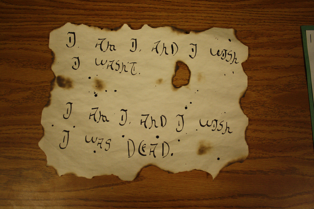
Project reflectionQuestion: Why did you use the medium you did?
I used calligraphy because it pertained to my project and the message I wanted to get across through my art piece. It's meant to be a suicide note, and I felt that calligraphy would give it a different mood. I also lit it on fire, to show that the pain the character was feeling was like fire and it burned her, so I showed that through my art piece. I chose this because it represents my poem well and is something I had never done before. Question: How were you able to get your idea across using the basics? I used unity in color schemes (notice the browning of the paper, and the darker shade of brown the fire caused), and used another simple color (the black ink from the pen) in order to created unity and a darker mood. The shape of the paper went from a square into an organic shape to show that the paper burned. And I used eye movement with my spacing between sentences and the focus point of the burned hole. Question: If you were able to do it all over again, would you do it the same way or what specifically would you change about your process on the project? I went through a lot of browned paper and burning to try to get it to look right, and I feel that it wasted time, resources, and paper. I feel like I would've benefited more if I created drafts on paper I didn't spend a long time and a lot of coffee browning. I feel like this was the best I could get it to be with my current skills. |
Click here to read my poem!
Egyptian brochures
In this mini project, we had to find an interesting part of art history, and do some research on the topic from the notes we took, along with independent research. We made this brochure in an Adobe program called InDesign, and put all of the information we learned into a visually pleasing brochure that, when printed and folded, would look like a professional brochure.
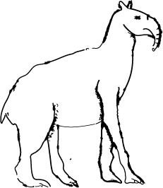
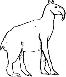
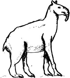
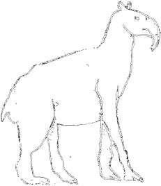
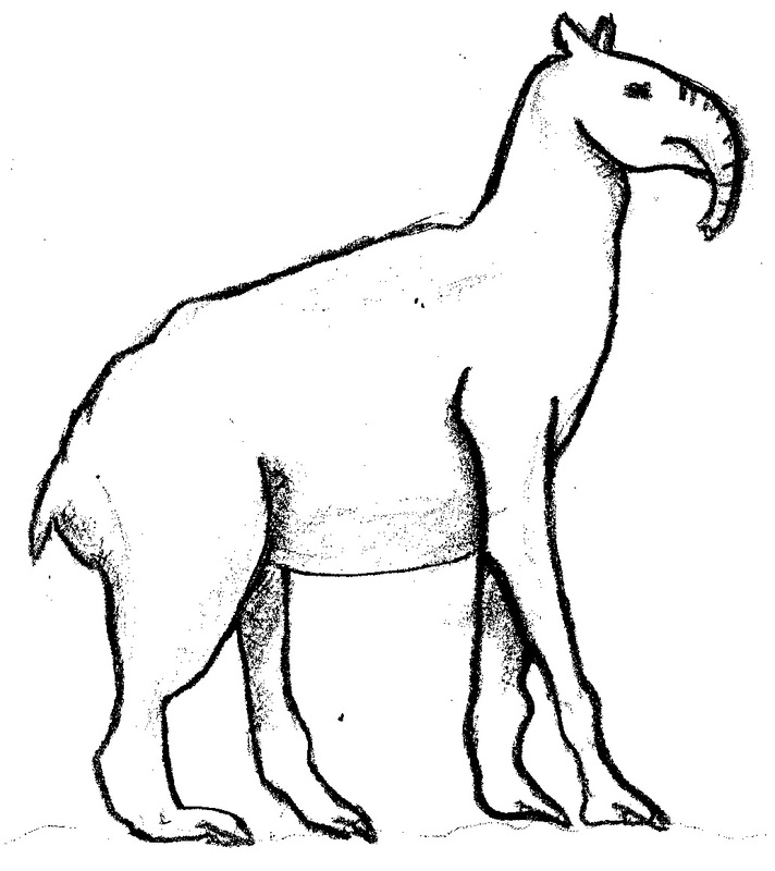
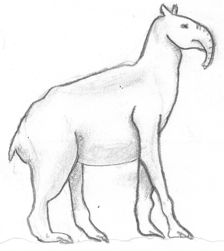
Prehistoric drawing
In this mini project, we were learning about art history, and as a part of that, we drew a prehistoric animal and scanned it onto our computers. We later put them through a program called Illustrator and did what's called a live trace. The last image in this photo set is the original, and you can see that all the others are when we put them through the program.

Stop Motion Animation Project
In this project, we created a stop motion animation. That's a series of photos taken with each little movement of your characters to eventually piece together and create what looks like a video. Eventually, we were to add sound, sound effects, an intro, credits, and whatever we felt would make our animation all that much better.
|
|
Project ReflectionI personally thought this project was stressful, seeing as the process of a stop motion animation is difficult. Through this project, I've learned perseverance, because a lot of the time, I was really confused about how to make my project better, when overall information wasn't good enough or wasn't helping me. This project was definitely a challenge for me, and I think for everyone else who did it.
|
Lighting and Depth of Field Study
For this study, we were playing with photography. Lighting, wide depth of field, and shallow depth of field. Lighting can be anything; natural or artificial. My example of lighting includes hard, reflected light; a bright light in one location with a reflector to shine light in other places. The other two mentioned are defined below. It was a 'prep' for our future animation project.
Lighting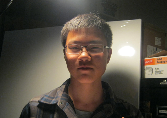
There is a form of lighting called hard light, and right here, we are using hard light using a white reflector. The light was shining from the top, so we placed the reflector under his head to reflect the light.
|
|
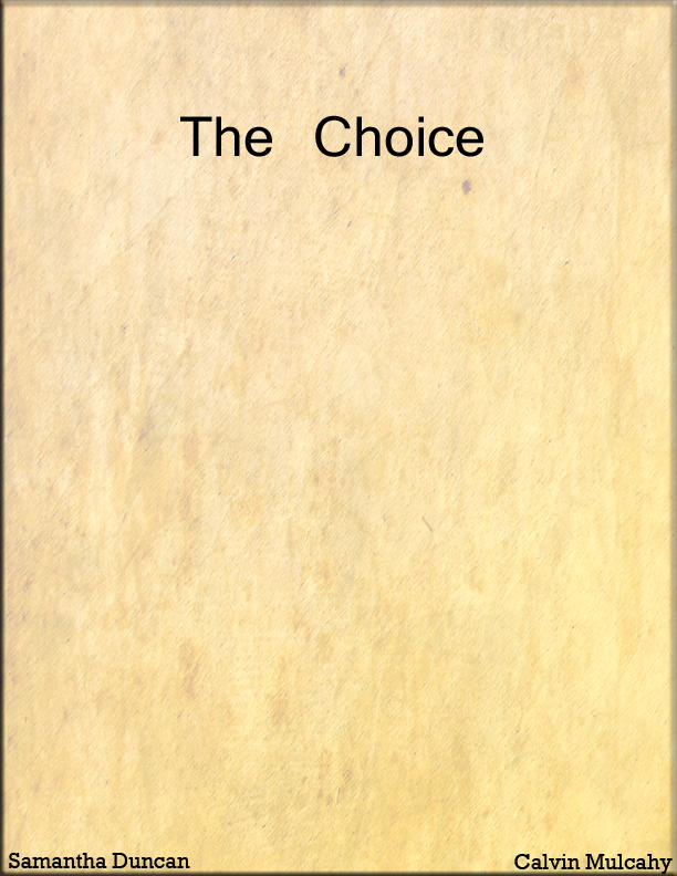
Poster Project
|
What did we do?
In our humanities class, we wrote and filmed a Greek tragedy, and so in digital arts class, Roxy had us make a poser (or book cover) for our project that represented and set a mood for that play/book. This is what I did for my play. You can go onto my humanities page to read my script, if you'd like! |
Essential questions
Question: What makes for an engaging book/poster cover?
You don't want to look at a book cover and have only words to summarize or intrigue you about the book, do you? You want an image. And the image or 'feel' of the book has to pull you in. For example, on my play cover, I decided to make it very plain and simple with the old paper texture so I can put across an isolated feeling, which sets a mood for the play. This makes it engaging because it's shows you the book through an image rather than the summary on the cover. It's also very critical to use your space correctly, and if you have a large, blank space, it's there for a reason. You have to think about how to use your tools correctly. The image translate a message and a feeling; that's how you make an engaging cover.
Question: How and why is art used as a vehicle for communication?
Why is it used as a vehicle for art? Because it would take up extra time to look at something and read through it to see its representation. If you were to view it, than you can almost instantly get the feel of things. How you would do this is do think about what colors or what images put across a certain feeling or message, and through that, people can deeper understand what you can't express through words. In my book cover, I didn't want to write "isolation", or "sadness', I made the art to represent that. That's me communicating to you through artwork.
Question: To what extent does a work of art depend no the viewer's point of view?
I wouldn't want to make a book cover, or CD cover, or movie poster that didn't relate to the audience I was presenting it to or the main idea of the topic being covered. I would want to make the image relevant to the topic. The viewer's point of view falls into play with this because they are the people who are going to interpret the piece of art, so since my play is about abortion, the main character feels isolated and sad because of this. I wouldn't want to show that through an image of someone laughing and smiling in a group of friends. This is how they fall into play; they wouldn't want to think they're going to watch a play about friendship when it's really about abortion.
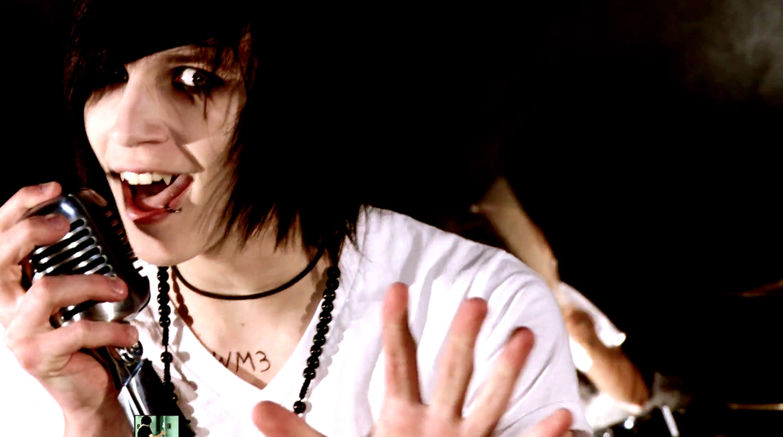
How-to videos
|
What did we do?
For this mini project, we were given a whole bunch of how-to videos for Photoshop, and we were given the freedom of choosing any school appropriate photo from the internet and edit it following one of the videos. We watched and edited along with three videos. The one you're seeing is my favorite. I turned his two front teeth into vampire teeth. I really enjoyed this project, because I could choose what photo I used and what I did to it. |
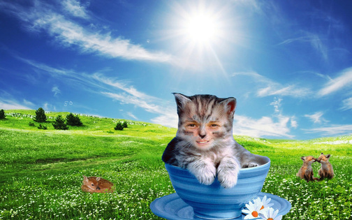
Teacher creature project
|
What did we do?
This one was my favorite project. We searched on the internet for any high quality picture as a background, and all high quality pictures for an animal, another person, or an object. Then, we took the face (or hair, or nose, or arm) of our favorite teacher(s) and edited them to become that animal, person, or object. In mine, I used Dave Heerschap's face and put him on a cute little kitty cat. I learned so much from this project. One of those things is that Heerschap doesn't make a very cute kitten. |
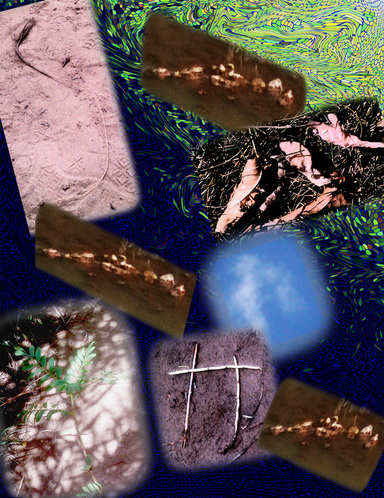
Name Project
|
What did we do?
For this project, we took cameras and went out to the park. We had to find things in nature that spelled out our name. A tree, a pile of leafs, a cloud, anything. We then went back and learned how to use Photoshop CS4 and were given time to play around and work with the images we took. It's safe to say I spent the most time messing with my background. |
